Login/Create Account
The first screen would be the standard login/create account. Once the client logs in or creates an account they are directed to the menu.


Overview of the project:
A European high-end doughnut manufacturer wants to enter the American market. Their only angle to stand out in this competitive market is to go above and beyond the current market norms and offer an ultra-high-end doughnut to a market segment that is insulated from economic downturns and wants a level of product that can be translated into status symbol within their social circles. Danka Doughnuts will leverage its network of locations as well as the exclusivity of the product to make it more desirable and in turn, create demand within the American market but yet still be able to meet demand reducing a spike in sales. What their market analysts have suggested is to find a way to make it easy to order no matter where they are and by whoever does the ordering.
Role in the project:
I will be designing UX/UI for the app that the staff/facilitators will be ordering these doughnuts. Ensuring that the branding strategy matches the app's ability to maintain a European sense of exclusivity.
The app has to be straight to the point and easy to use.
The app has to carry European branding, a bit stark but also has some sense of history.
The app will be used by the staff/facilitators from different parts of the world to order.

Persona:
Lisa
Age: 48
Private Staff and Supply coordinator.
Tech Savy, Athletic. Enjoys volunteering and Travel.
Constantly looking for new foods to purchase for her employers.

Persona:
John
Age: 52
Private Chef
Loves his phone and new tech gadgets
Always looking to spend more time with his family since he has to travel for work so often. He does all of the shopping and cooking for the family he works for, including the homes, ships and jets.
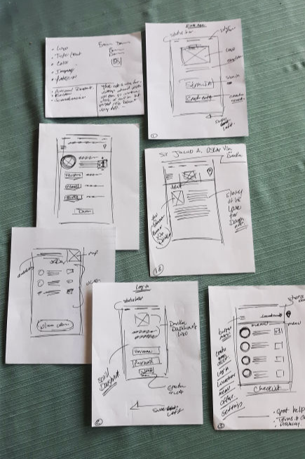
I started to develop where the elements would be placed and bullet-pointed the assets that would have to maintain consistency.
I thought about what would make a cohesive strategy to make the ordering process flow more smoother and natural.
I ordered my notes into a more of a step by step approach if I were the customer and what would make sense.
The ordering process would have to be logical but not so constricted that the customer feels as if they have too few options. At the same time, we want the customer to explore the brand and options.

The first screen would be the standard login/create account. Once the client logs in or creates an account they are directed to the menu.
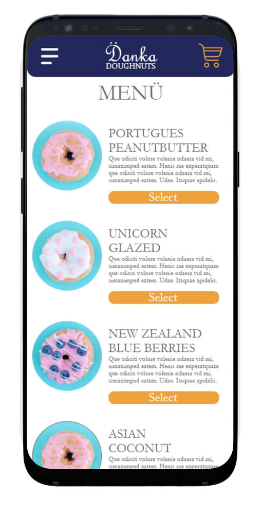
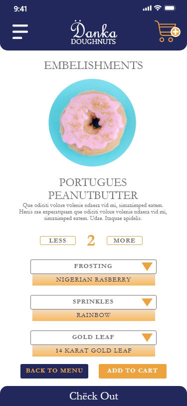
The menu will allow the customer to review choices and select which item they want. Once they have selected the item they can review the "embelishments" as well as the quantity.
In this screen, customers can review quantities of each item and what the toppings would be. They will have several options. From there they can check out or go back to the menu and add more items.
Customers can review the order, finalize the order or go back to the menu and make changes.
At this stage, the order has been placed and there is a "Thank You" message as well as a bit of scheduling messaging that reinforces the brand.
Person 1 : Had no issues that I could observe. I asked questions about typograpy, color, ease of navigation, etc. but he had no issues. Requested feedback but there were no issues.
Person 2: This person navigated easily through the app and was able to complete the order without any issues. She did have some really good insight that I didn't anticipate.
Feedback / Suggestions:
1. Add Terms and Conditions to the first screen so that people can have transparency.
2. Add the ability to order in different languages. Staff that work on the ships often are from another country.
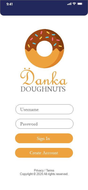
Login

Menu
Specifics

Check out

Thank You for your business
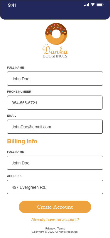
Create an account
Play the video to view a walk through of the app and the ordering process.
web page was made with Mobirise website templates
Reach out and say Hello! alex@galaxystudio.co