Login/Create Account
The first screen would be the login/create account. Once the client logs in or create an account they are directed to the home screen.

Overview of the project:
The current app for the Broward County Library system was not on brand compared to the desktop/mobile site. The desktop/mobile site is a facet of the larger county government website. The library needed an updated app that carried a cohesive brand style as well as all functionality that the desktop/mobile app offered. There were also too many directions for menus that took you in different directions; the app takes you to get information through the card catalog interface, the WOWbrary in a browser environment, and sometimes it dumps you on the governmental website. There are too many twists and turns and it all feels like a disjointed experience. Not people friendly at all.
Role in the project:
I'm designing the UX/UI design as well as working out the research and testing.
Realign the UI to match the branding styling of the web/mobile county government. More open and friendly.
Rework the paths so that menu options and quick links are better grouped. Keep the user with the familiar app environment instead of leading them outside of this environment.
Setup navigation that is both friendly to adults and children. The navigation should be forgiving to first-time users.

Persona:
Grettel
Age: 49
Full-time mother with two children.
She looks for positive activities that could benefit her children's education. She enjoys cooking, socializing with other parents, and learning something new from the unexpected. She does not view new tech in a positive light unless it can save her time in her very busy schedule.

Persona:
Miranda
Age: 19
College Student
She enjoys researching at the library because it places her in a space that disconnects her from other distractions. Views the library as a positive because her mother started taking there as a child. She is very tech-savvy.
I began with the idea that the flow should be easy to work through for people at all levels of comfort with technology.
The process of the "search" is the most basic of functions within any component of a library app. So I started with the idea that anyone should be able to pick it up and perform the search.
I didn't want to leave out the ability to review the programs the library offers so I added the "Quick links" tab. For others that want to customize the app a bit more deeply, I added a menu at the top right.
Compiling these ideas together I worked towards a UI that was simple to navigate and a UX logic that allowed for a more seasoned user.

The first screen would be the login/create account. Once the client logs in or create an account they are directed to the home screen.
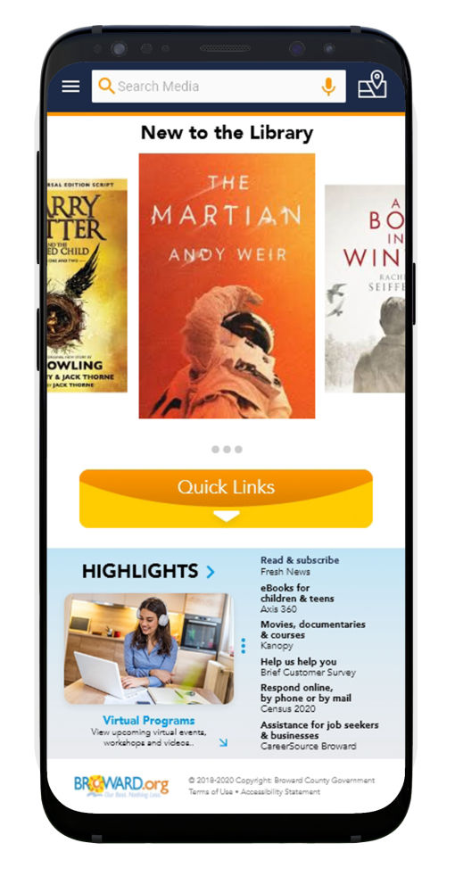
The home screen allows the user to navigate through either the menus, quick links, or begin their search. The home screen allows the library to feature classes or events they have going on.
The search for media is similar to many other searches, this is done purposely so that the search process is familiar and more comfortable.
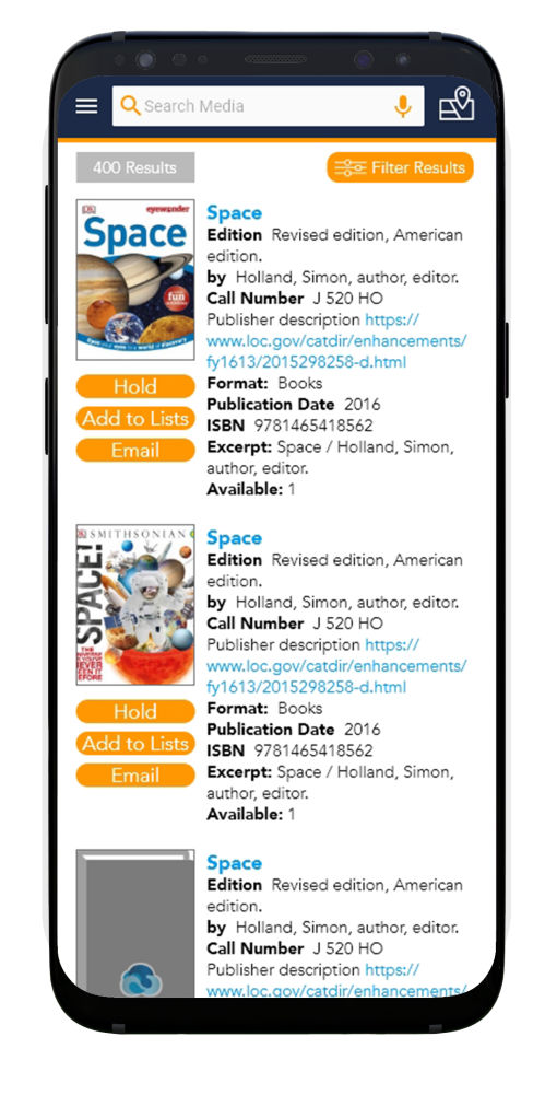
The results of the search are returned in a vertical menu and the user is allowed to filter the search results. The user can also place a hold, email, or add the media to a list.
When you choose the specific media you get more detailed information and you can apply the same functions as the screen before, hold, email or add to a larger list.
I added slide down for the branch locations maps at the top.
Quicklinks is a tab of common links that can be needed more often and pinned it to the home screen.
There is also a more detailed app menu that allows you to make more detailed adjustments that the user would consoder long term adjustments. i.e. linking their childrens library card, setting language, changes to card accounts.
Person 1: Had a bit of apprehension using the app but was able to successfully navigate through the search. She had some concerns and added good feedback from a key demographic.
Person 2: He worked through the app with no issues. His only concern was a location since it took a while to get to the location and led to good feedback.
Feedback / Suggestions:
1. The first person wanted to see the ability to lock out her children to only "children friendly" media but wanted to keep her ability to search for anything. This led to a filter setting for specific library cards that her children use.
2. The second person wanted to see a map added to the app so that they can identify the closest location to where ever they are.

Login

Home Screen

Quick Links Drop Down Menu
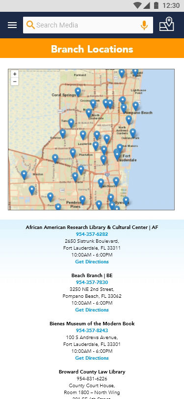
Drop Down Branch Location Map

Search Result

Media Detail
Play the video to view a walkthrough of the app and the search process.
Start your own site - Get now
Reach out and say Hello! alex@galaxystudio.co