Home Page
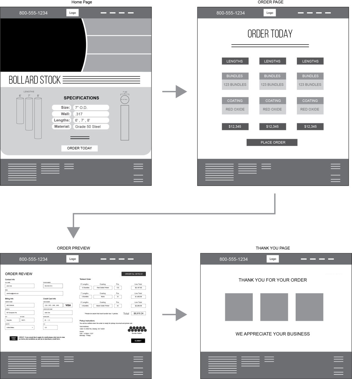
The homepage introduces the product and comapny using brand appropriate graphics. This also give the purchaser the specs for the product and starts the order process.
Overview of the project:
OPS has access to a great deal of 7" straight seam pipe that would be ideal as stock for bollard manufactures. They had a few issues because they wanted to sell it as a slightly branded product so that they can feature it in a different light and have purchasers compare it to pipe prices because of all the work that goes into setting up the stock. They also wanted to give the purchasers the freedom to process an order from anywhere they might be so we added a mobile site. This had to be an easy process that inspired confidence.
Role in the project:
My role will be in researcher and UI design development.
The introduction and the ordering process had to be easy. Many of these fabrication shops, especially the smaller ones that have been around a long time use older ordering systems.
The branding had to inspire confidence because there are too many companies that just want to dump bad steel on fabricators. The branding also had to appeal to new incoming purchasers and sales staff that were just starting out.
The purchasing agent had to know what exactly they were getting, transparency was key. Even the bundle size and weight per foot for a max flatbed load had to be calculated.
I worked in the steel industry for 5 years and had the opportunity to work with several purchasers form all kinds of businesses, both big and small. The biggest hurdle was gaining their confidence and our biggest hurdle as a company that sold steel was making the process easy so that we could get to the next customer's needs. One thing I've learned was that the only thing people buy is confidence. purchasers are willing to spend a bit more even if you have a less expensive product just because the more expensive product will not come with more problems than the money they are saving. The only thing that will ruin a sale once the purchaser has bought in is a cumbersome process.
The more difficult the process the more they will feel that you're not being transparent. I spoke with several purchasers and discussed their needs and processes. Being that we are in a good economic climate the business owners have been able to invest in more modern purchasing systems. There has also been a bit of a wave of younger professionals moving into purchasing roles, either from sales or company owners that are bringing in their children into the business. All had the same need, they wanted a simple way to purchase and to know up front what they were getting.

Persona:
Daryl
Age: 43
Purchasing Agent for mid-sized fabricators in the midwest.
He has a young family so he works hard and is always looking to save time so that he can have more time with the family. These efficiencies also translate towards a more organized work zone. He enjoys travel with his family when he can and loves fishing. He holds a business degree and is working on his masters, he may not be at his current position forever but he wants to improve the system for the next person.

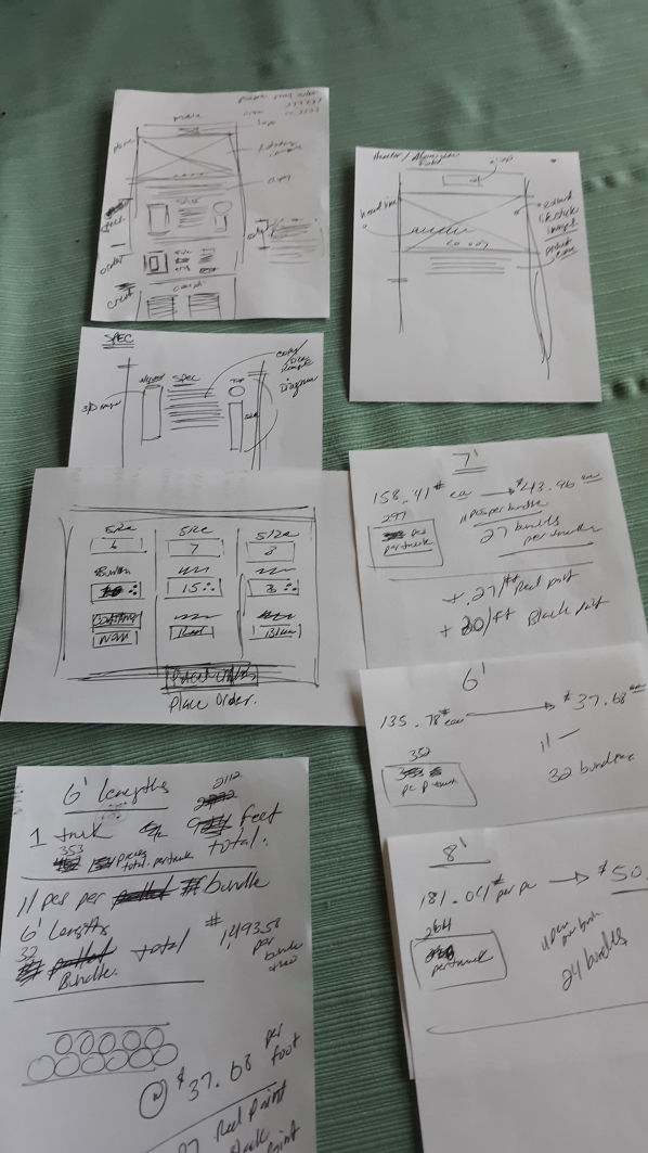
I designed the website with the idea that the process had one of the most important facets of the process. All of the UI would grow from the process and it needed to be thought through from the initial spec to how the weight would maximize on the flatbed truck.
The process starts with the spec of the product and then moves toward setting up an order. The order would process allows you to specify how many bundles, coatings, and lengths. The price is presented upfront before the purchaser submits the order, this allows them to change the order before they place the order for whatever reason.
The weight of the bundles is set by weight to maximize their capacity on the flatbed trucks for efficiency. This keeps freight costs down and the customer always wanting to maximize their order. This was a factor of importance in the comments of the questionnaire.
Keeping the user in mind and their needs were my guiding principle.

The homepage introduces the product and comapny using brand appropriate graphics. This also give the purchaser the specs for the product and starts the order process.
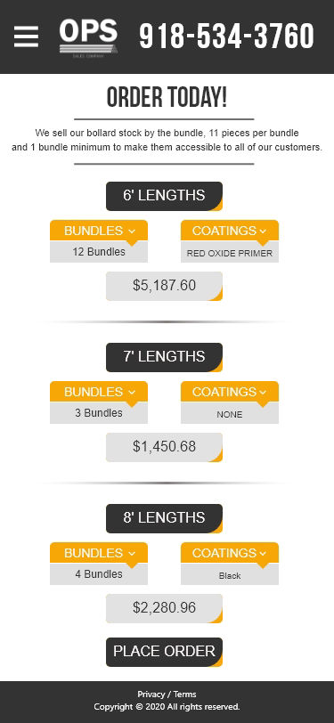
The order page allows you to setup the load. You can specify the lengths, bundle count and coatings. This page also gives you an estimate to your order so that you can keep within budget.
The review page allows you to fill in the order information. You can look over the stock that was ordered and it will give you the bundle stack so you'll know if you need dunage as well as hours and address of the yard.
This page gives you a confirmation and a "Thank You" that the order has been placed. Then it redirects you back to the homepage.
Test 1: He started out well and started to work through the process. He had concerns about his budget and the estimates and felt the need to keep everything in budget. He completed the order but had freight concerns. His feedback was good and the experience was improved.

Feedback / Suggestions:
He had concerns about being able to make edits to the order before he processes the order, his budget was tight and with freight costs rising edits to the order were necessary. I added a back button to the order review page so that changes can be made before the final order placement.

Home screen with specs

Bundle and coating
screen with estimator

Order Review Screen

Thank you screen that transitions back to home screen
Play the video to view a walk through of the website and the ordering process.
Play the video to view a walk through of the mobile site and the ordering process.
Designed with Mobirise - Check it
Reach out and say Hello! alex@galaxystudio.co